 I’ve been spending some time recently researching the evolving world of responsive design and want to collect here some of the information, guides and tools in one place.
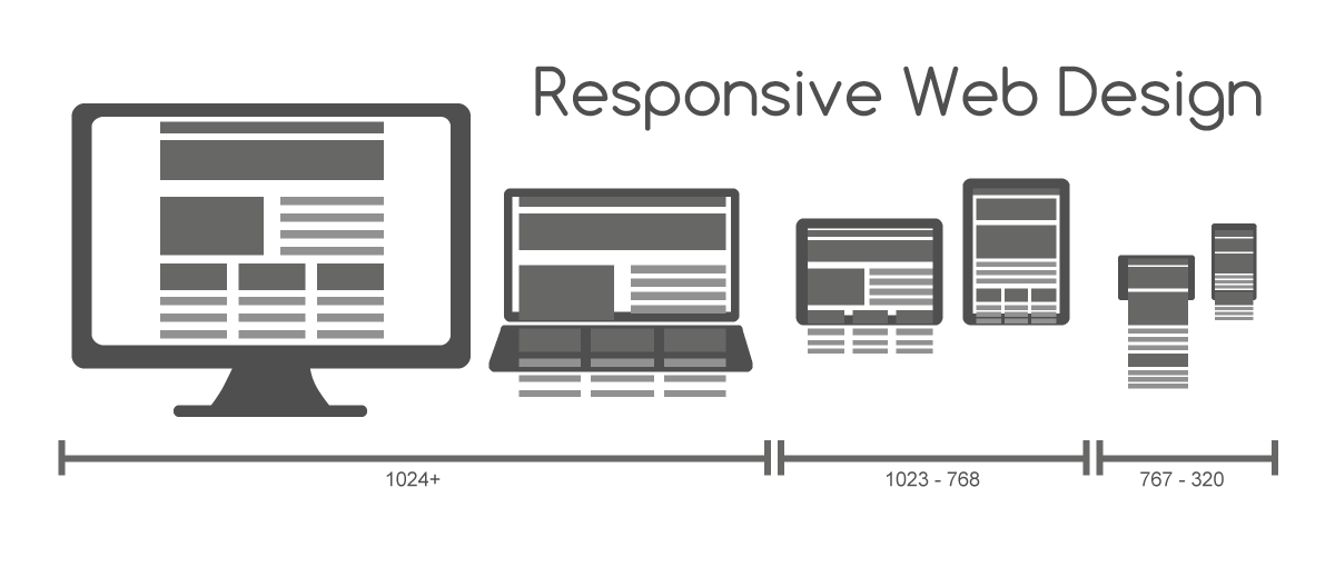
For starters, here’s a general overview of responsive design including tips and examples: Responsive Web Layouts For Mobile Screens: Intro, Tips And Examples – www.hongkiat.com/blog/responsive-for-mobile-screens/
Now for some more technical articles which get stuck into the detail of designing for different screen sizes:
- Improve your responsive design approach
– www.sitepoint.com/7-responsive-web-design-tips/ - Responsive design problems and how to avoid them
– www.creativebloq.com/responsive-web-design/problems-8122790 - Developer tips for responsive design
– readwrite.com/2013/04/16/10-developer-tips-to-build-a-responsive-website-infographic#awesm=~ozmZLd1NiGu5MO - Responsive design tips and approaches
– 99designs.com/designer-blog/2012/12/03/responsive-web-design-key-tips-and-approaches/ - Off canvas navigation
– www.lukew.com/ff/entry.asp?1569 - Mobile readynes
– ready.mobi/launch.jsp?locale=en_EN - Smartphone optimised sites
– developers.google.com/webmasters/smartphone-sites/
And finally some online tools to help with the design process:
Leave a Reply