Category: Design
-

A problem with mapping a process
A lead designer at Made Tech, Vicky Houghton-Price has written about the relentless desire for process maps. She shares her frustration that the request is often disparate from the artifact’s true purpose and value, instead, it becomes something that only shows work has been done: Do you need another map? Probably not. An aspect of…
-
Accessibly whimsy
Elise Hein writes for uxdesign.cc about missing the fun in accessibility. Much of the whit and whimsy of the internet is restricted to those who have the pleasure of browsing with whatever browser they like, with no need for ever changing the default settings. Instead of keeping easter eggs and bonus content neatly tucked away…
-
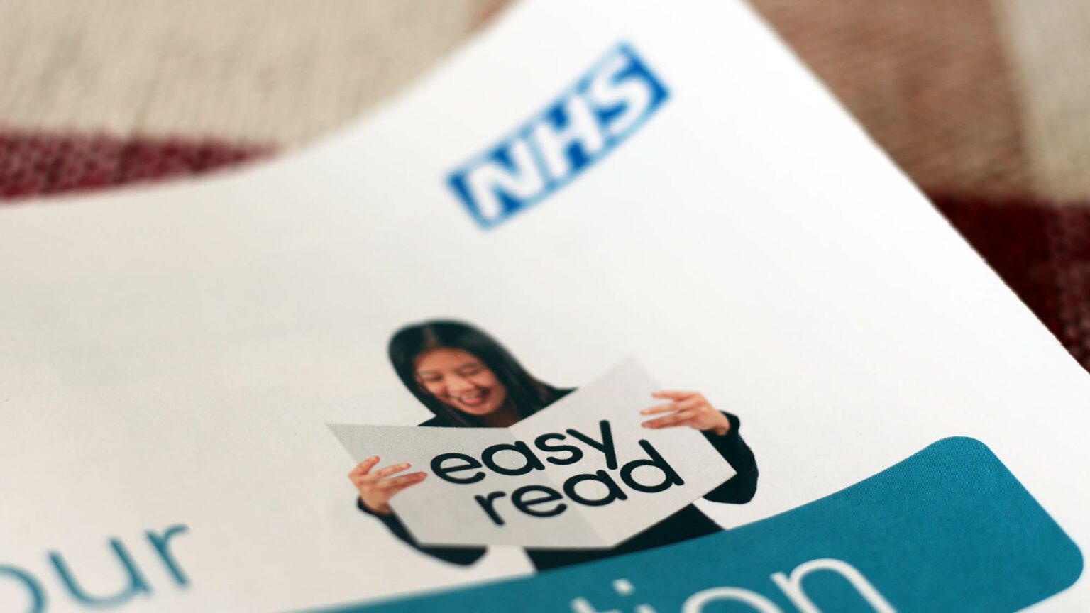
Easy is hard
On the Design in Government blog, John Newton has written about creating Easy Read content. So, to clear things up, easy read is used mainly by people with learning difficulties. It uses pictures and text to convey meaning. He created prototypes and conducted user research on them with real users. The insight was invaluable. It’s…
-

Be consistent. But consistent with what?
At UX Collective, Duncan Stephen writes about consistency in design. He points out that there’s a real danger in being too consistent, as it can make individual services within a large portfolio harder to distinguish. But what were Microsoft thinking when they designed the icons for SharePoint and Sway? Not only do they have the…
-
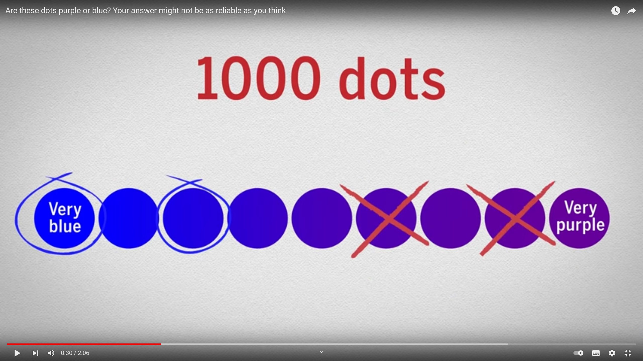
Humans will always struggle to be content
In 2018, Brandon Speck wrote an article in www.livescience.com about “Prevalence-induced concept change in human judgment“. It details a series of experiments which show how important context is to humans in how they perceive world around them. 200 subjects were shown 1,000 coloured dots and asked to identify which were blue, and which were purple.…
-
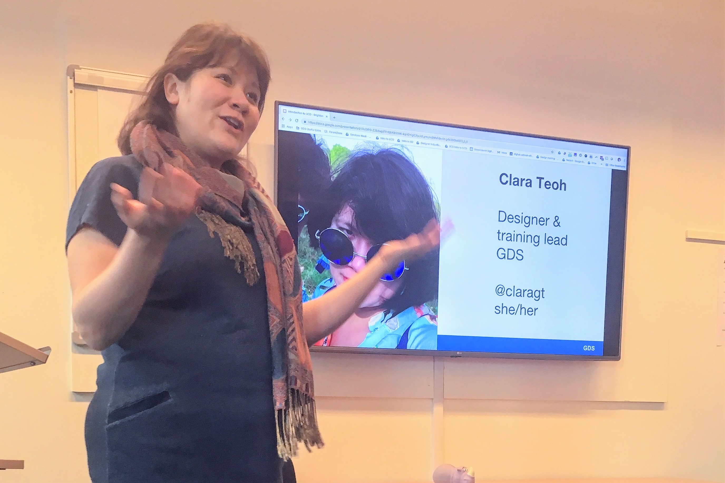
User centred design, the GDS way.
I was recently in Brighton where the city council hosted a Government Digital Service session on user centered design. Here are things I found most interesting.
-
The power of context in UX
uxplanet.org has a tidy summary of 7 principles which can be applied to digital service design to influence people’s behavoir.
-

Tips for young designers (or young people in any career)
David Airey’s blog has a nice excerpt from small NYC based design firm Sagmeister & Walsh’s answers page. The section on advice for students gives the following tips for young designers, but they’re applicable to starting out and succeeding in most professions. The parts that most ring true to me are: One of the most valuable things you can do…
-
Roads that wirelessly charge electric cars
Here’s an ambitious forward thinking project – cables under roads which can generate a field which is picked up by a special coil built into electric cars to charge them. Highway England plans to run the off road trials of charging roads for 18 months before moving to public highways. Over next five years, UK will invest £500…
-

(Very) Honest webdesign feedback.
How can you get really honest feedback about your website or digital project? Richard Littauer realised that when he gets drunk, he gets very honest, and it turns out people are willing to pay for his honest appraisals of their work. So he set up The User Is Drunk. In fact, so many people have been willing…