Category: Design
-

The best design is invisable
When something has been designed exceptionally well, you shouldn’t notice “the design”. You should be using a service which just works, not fighting to understand what the process is or guessing what you’re meant to do next. So here’s a video about the recently released film Mad Max – Fury Road. The connection might not be obvious,…
-

Great design doesn’t need to “wow”
Another post about good design. It doesn’t need to “wow” its audience, good design works. And it may look boring or dull, but if it allows people to accomplish what’s needed quickly and efficiently, and people want to use that design again and again, then that is good design. Matthew Ström at Medium.com writes about this in…
-
Analog tools to help you design
In a digital world where you can be overwhelmed with online services to help wireframe, brainstorm and project manage, it’s nice to see some attention being given to some offline tools by devlounge in their list of 8 Analog Tools to Help You Design. When working with clients there’s nothing like being able to quickly sketch a…
-

The value in what’s free or hidden
I’ve spent my career in the charity and public sector, where services are often offered to those in need for free at the point of delivery. This can present an unappreciated problem – if something is free, how accurately is it valued? Over recent weeks I’ve read a few articles which have looked at issues…
-
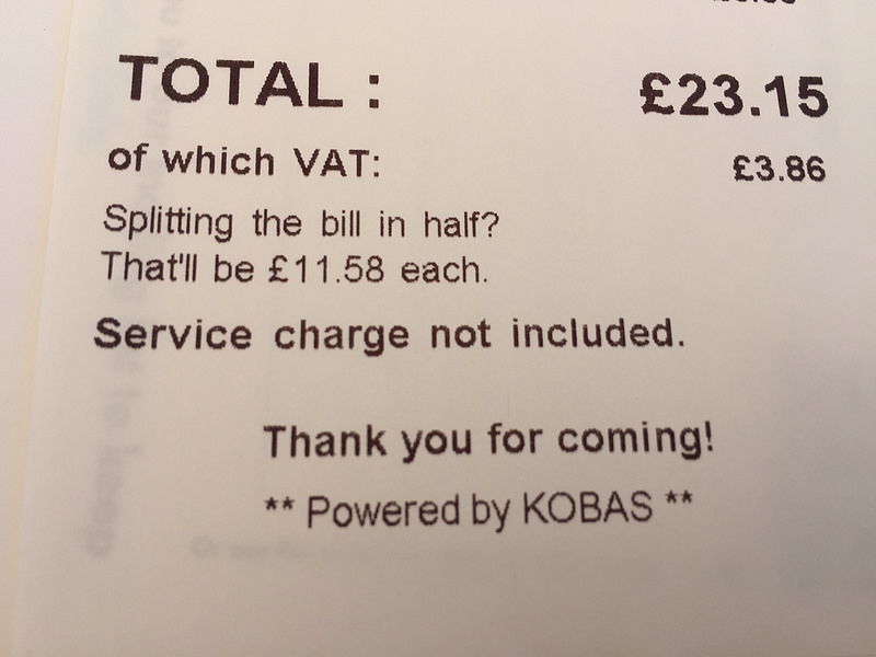
Digital services – doing the hard work for you.
One of the more ambitious design principles of the the Government Digital service is number four: Do the hard work to make it simple. But it’s not all about digitising complex processes, it’s often about the little things that make a difference, like this little calculation at the bottom of a restaurant bill, noticed by Ben…
-

Presenting practical presentations
“Death by powerpoint” is a phrase I’ve heard from someone at some point wherever I’ve worked. Hopefully if you work at GDS, or spend a lot of time attending events where someone from GDS is presenting this isn’t the case. Here’s Russell Davies explaining why: Doing the hard work to make it big and Doing the hard work…
-
Being a digital human – a fear to break the magic
I’ve been meaning to recommend the BBC Digital Human radio show and podcast since my wife found it a few weeks ago and it’s one of those programs that I wish I’d found sooner. Thankfully the BBC have a full podcast archive and a tumblr blog so you don’t miss out. The program looks at how at how…
-
Littering says a lot about you.
Do people litter because they’re lazy? Or a lowlife? Toronto has recently run a campaign using litter to spell out what kind of person make a mess of their city. A simple idea well executed. From www.visualnews.com/2014/08/26/littering-says-lot-smart-ad-campaign-toronto/
-

Build your website based on evidence, not false beliefs.
Zoltán Gócza and Zoltán Kollin have created a list of common web design misconceptions and collected data, facts, quotes and articles to separate fact from fiction about so many so called myths. It’s an essential list for anyone working with websites, not to learn from, but to make your job of educating and providing the necessary evidence…
-
Designing the dull stuff.
When people think of designing a website, not a lot of thought is often given to the user experience of the privacy policy, legal disclaimer or other “dull” content. The web designer depot has collected together a few examples of websites who have put some effort into how their legal content is displayed, looking at summaries, highlighting…