Another post about good design. It doesn’t need to “wow” its audience, good design works. And it may look boring or dull, but if it allows people to accomplish what’s needed quickly and efficiently, and people want to use that design again and again, then that is good design.
 Matthew Ström at Medium.com writes about this in his article “Well-designed interfaces look boring“. Here’s an abstract:
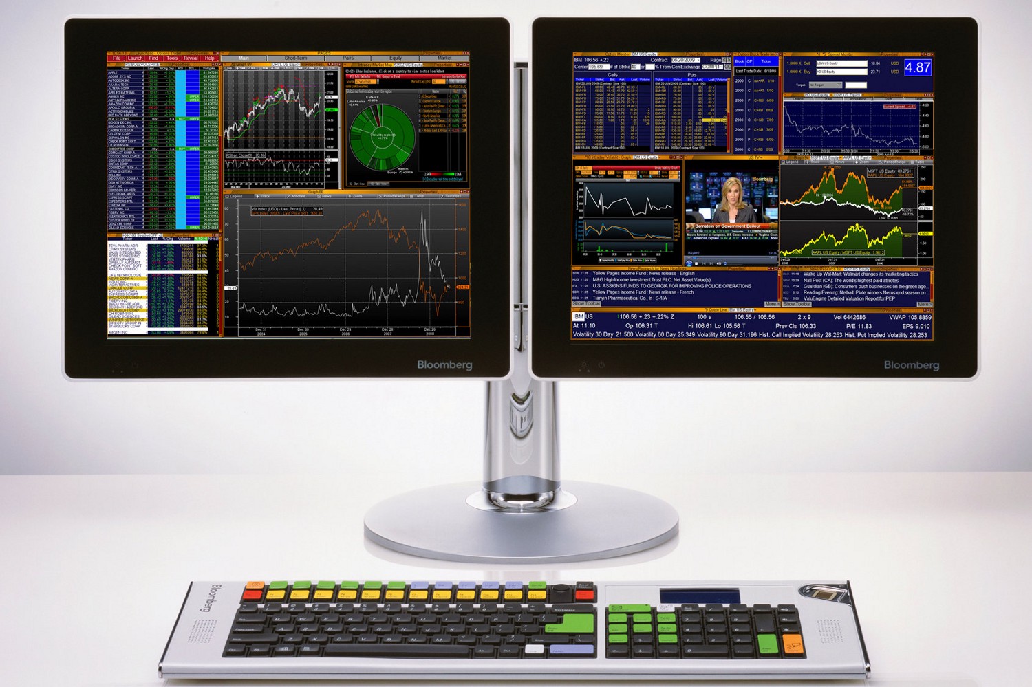
This monstrous pile of letters and numbers nets Bloomberg roughly 6.3 billion dollars a year. Friends who have used it rave about its ability to quickly visualize a vast amount of information; a specialized keyboard allows users to command financial data with speed and accuracy. It is ugly as can be, but it is brilliantly designed: There is a deliberate hierarchy, an accurate color scheme, concise and useful charts, and clearly-labeled tools throughout. Perhaps more importantly, it’s boring.
Read the full article at https://medium.com/mission-log/well-designed-interfaces-look-boring-568faa4559e0

Leave a Reply