
A lead designer at Made Tech, Vicky Houghton-Price has written about the relentless desire for process maps. She shares her frustration that the request is often disparate from the artifact’s true purpose and value, instead, it becomes something that only shows work has been done: Do you need another map? Probably not.
An aspect of the article stood out in particular – the comparison of how digital maps (such as Google Maps) are interacted.
Through the magic of Google maps, you need to zoom out and see that it sits in the Peak District and Derbyshire, or maybe even the UK before things start to become clear, and I finally know where I’m going on holiday. Exciting.
Vicky Houghton-Price
Visual hirachy
Often when a map is built using a tool such as Mural, Miro or FreeForm, the interactive versatility of the tool is often ignored. The artifact is created to be viewed in one particualr way. This is most evident in the lack of a visual hirachy in the design.
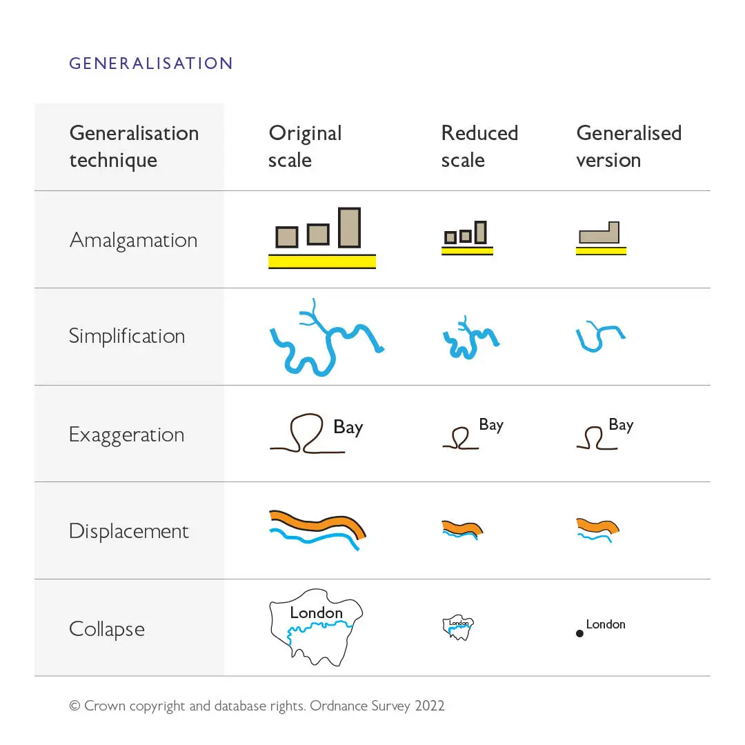
Google Maps understands that people need different maps for different tasks (and this is well known by cartographers – see “4. Generalisation” at the Ordnance Survey blog).
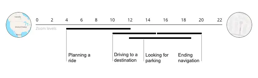
A simple example is planning a journey from your home to a new destination. Initially, you need to know where the destiantion is in broad relation to where you are now – will it take days, hours or minutes? You need to see the start and end points in context against a country or county.
When that is established and you plan you route, you need more information. And when you leave, you need precise details about road names and distances.
Interactive maps
It would be completely overwhelming to present all the information at once – instead, interactive maps allow a person to zoom in and out to see the amount of detail needed to fullfil their needs. Many levels of visual hierarchy can be identified when reviewing the different needs of someone planning a journey (=Alex Parlato describes this well in the Mapbox blog “Maps for navigation Better visual hierarchy of features and a cleaner, lighter map“.)
Process maps
When a user/journey/proces map is created, it is often designed just with the detail in mind. As you zoom out of Miro, the information becomes ambiguous shapes and the value is lost. Miro have written a guide to creating a dynamic visual hirachy to help resolve this problem for their users.
By thinking about how the map could be viewed as one full illustration, AND as a detailed process description, more value can be created from the effort spent creating it.
Tips to improve a process map
- Have large bold headings for sections which can read when the whole process is viewed.
- Group parts of the process within a background shape so the overal progress can be detirmined when zoomed out.
- Use high contrast colours for the large headings to help them stand out, and lower contrast colours for the detailed information when a user zooms in.
- Link between headings and grouped sections to aid navigation
- Take a look at “12 Visual Hierarchy Principles Every Non-Designer Needs to Know” from visme.co for more inspiration, particularly their summary infographic.
Thanks to Vicky for the inspiration for this post, you can follow her at twitter.com/vhoughtonp and read more of their thoughts at medium.com/@vhoughtonp
Leave a Reply