I used to be impatient, but now I just don’t have the time
Google have released some new guidance on designing fast mobile websites, which can load a page on a mobile within a second. The one second rule come from research by the Nielsen Norman Group that 1 second is:
“about the limit for the user’s flow of thought to stay uninterrupted”
or explained in more detail:
“(the) limit for users feeling that they are freely navigating the command space without having to unduly wait for the computer. A delay of 0.2–1.0 seconds does mean that users notice the delay and thus feel the computer is “working” on the command, as opposed to having the command be a direct effect of the users’ actions. “
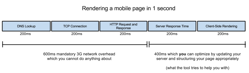
This 1 second rule can be achieved by focusing on the above the fold content, so the visible page loads within a second and then continues to load off screen.
The tips get covered in detail on the mobile page speed help pages and there’s also a PageSpeed Insights tool.
1-2-3-4 I declare my thumb can’t reach.
Product designer Scott Hurf has written about the problems that large mobile screens give designers, and some research and advice on how to design for the big screen and small hand.
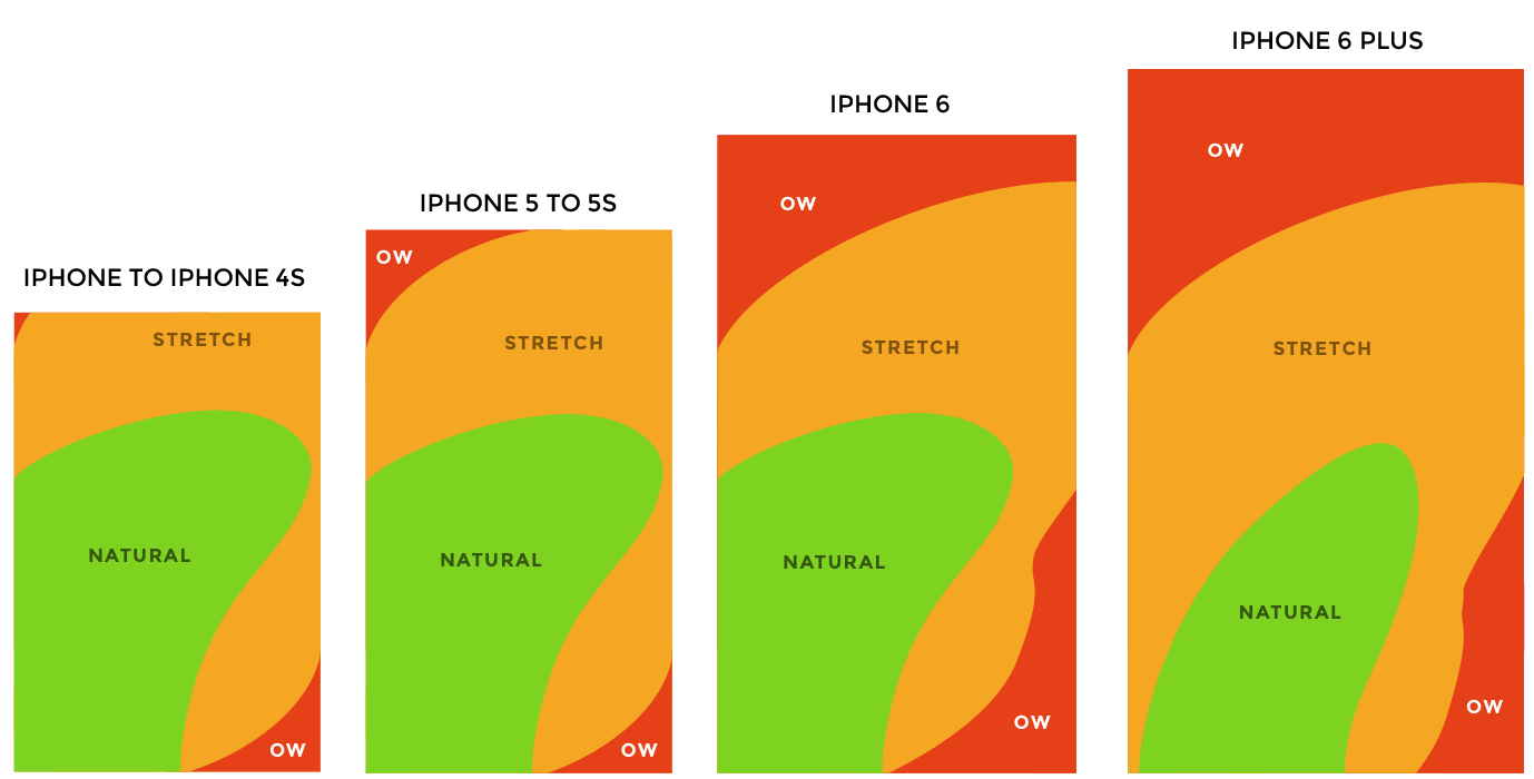
 The issue is clear in a graphic showing the area a thumb can reach on every iPhone released so far, including the 6 and 6 Plus. The amount of unreachable screenspace can cause serious problems for app and web designers who would typically put links to menus at the top of the screen.
Read more about the resarch and download free templates at scotthurff.com/posts/how-to-design-for-thumbs-in-the-era-of-huge-screens
Leave a Reply